
“How can I design and build UIs in a way that is maintainable, fast, and scalable?” Answering this question was the goal of this project.
NomadHair Component UI Library solves this problem with a shared library that bridges the gap between design and engineering workflow.
Role
Designer, Developer
Scope
Design System Foundation,
Component Design,
Storybook Component Library,
Automating Accessibility Test
Timeline
Mar 2024 - Apr 2024
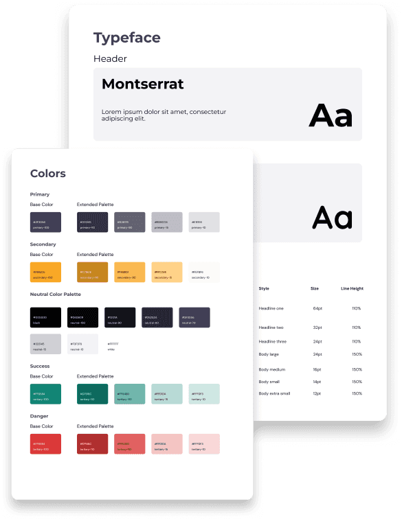
While creating UI layouts, I looked for repeated use of color, font sizes, or other styles. If any elements were to be used throughout the project, I abstracted them out into a design system.
This way, I could avoid making the same design decision twice.
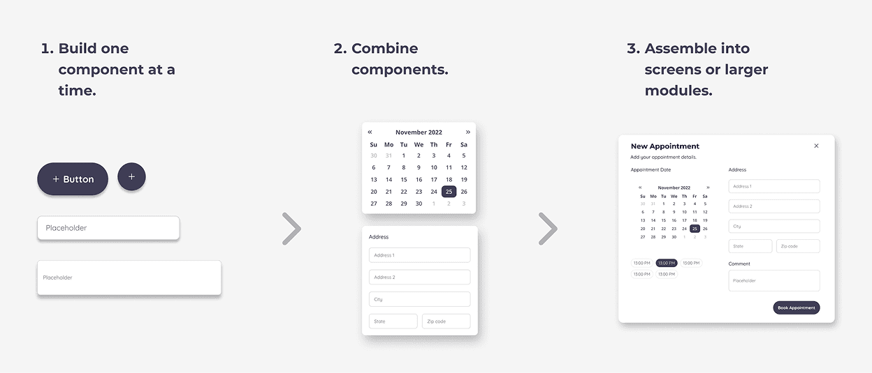
Building in Component-Driven Approach
The challenge of modern UI development stems from an ever-increasing pace of change, customizations, and unpredictability that require rapid iterations.
This way, I could avoid making the same design decision twice.
I adopted a Component-Driven approach by designing UIs at the smallest component level.
Bridging Design & Development (feat. Storybook)
To reduce the feedback loops between design and development workflow, I used Storybook (V7) to develop and test each component in isolation.


Automating Testing with Github CI
Testing is integral to every product development process.
Beyond just being able to iterate quickly, I implemented accessibility and interaction tests to ensure the quality of each UI component being designed and built.

To take this a step further, I used Github CI to automate testings for accessibility, interactions, and visual regressions.

Every time I push code to dev branch, Github CI will run UI tests to verify the changes, which keeps the productive workflow